Wireframe CRM record redesigned into a cleaner layout: UX-decision animation made with Opus 5.5 (X video)
Oğuz B (@moguzbulbul) · 2026-09-27 · ai-made · 202,470 views
Made by AI
Model: Claude Opus 5.5 · Series: Code-rendered film (LLM writes the program that draws every frame)
Evidence: X post (2026-09-27): 'I was struggling to explain my UX decisions in interviews, so I made this kind of animation with Opus 5.5 / Anyone want the skill?'
Human role: Creator made it to explain UX decisions in interviews; offers the skill used.
Pipeline: Opus 5.5 (with a custom skill) → explanatory UI animation
What's in the video
Description written by Gemini, which watched and listened to the whole video.
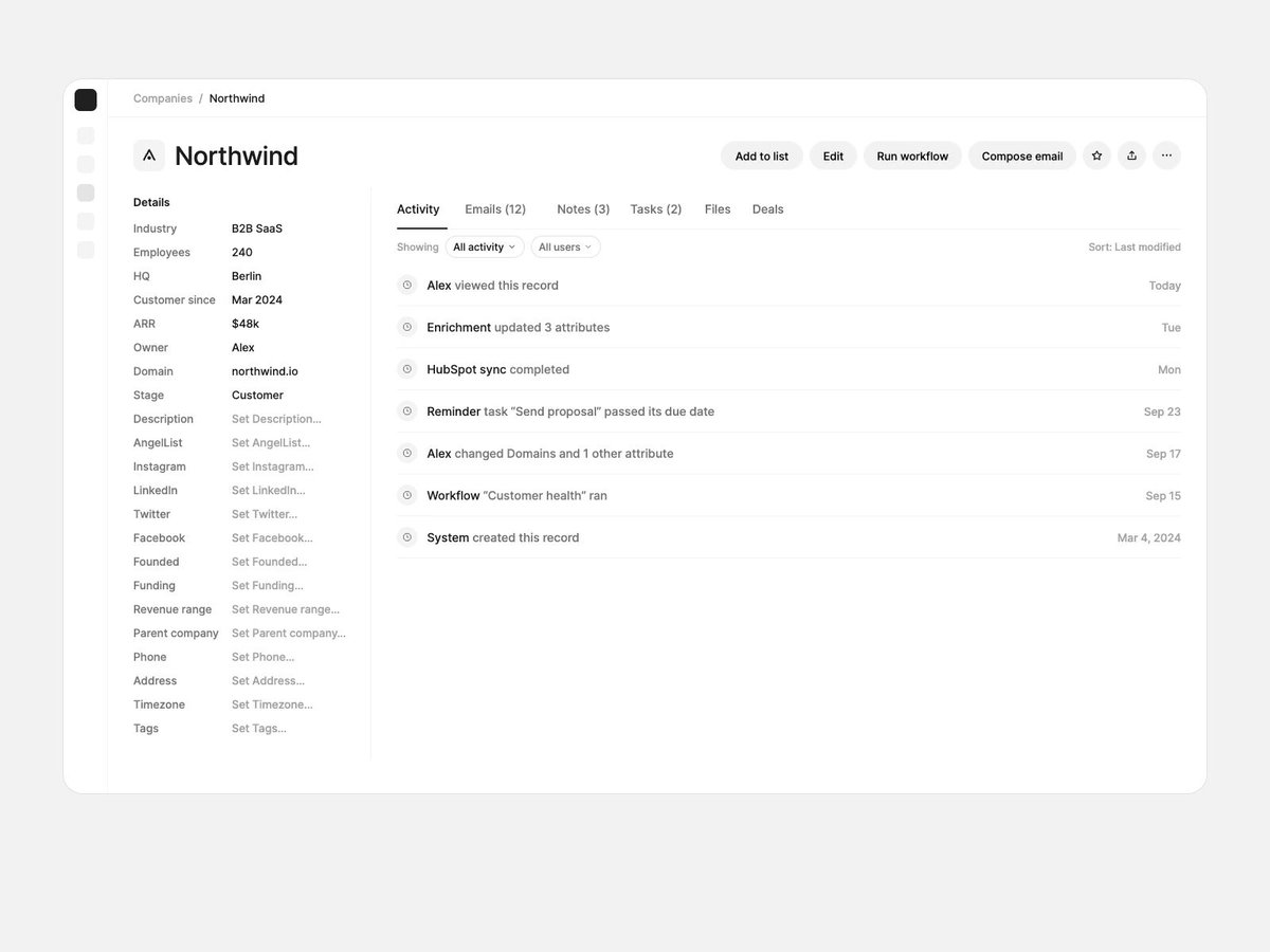
Summary This video presents an animated case study illustrating a UX/UI redesign of a complex B2B CRM record ("Northwind") from a traditional cluttered interface into a focused, modern workflow. Shared by designer Oğuz B (@moguzbulbul), the animation uses blue wireframe blueprint overlays to break down five sequential design decisions that transform the page layout.
What is shown
- [00:00 - 00:07] Step 01: One Primary Action: Highlights six top-level action buttons of equal visual weight (
Add to list,Edit,Run workflow,Compose email, etc.) and consolidates them so thatCompose emailis elevated as the primary action while secondary options collapse into an overflow menu. - [00:08 - 00:16] Step 02: Hide Absence: Critiques the left sidebar's 22 detail rows (where 14 rows merely prompt to "Set [attribute]..."), collapsing key metadata (
B2B SaaS,240 people,Berlin,Customer since Mar 2024,$48k ARR) into a single compact horizontal header row with remaining properties hidden behind an "All details" trigger. - [00:17 - 00:23] Step 03: Open Work First: Reorganizes task visibility by pulling overdue and pending items out of hidden tabs and system logs, creating an elevated "Needs you" card directly below the header showing prioritized tasks (
Send renewal proposal,Reply to Mia,Schedule QBR). - [00:24 - 00:30] Step 04: One Timeline: Streamlines a fragmented feed of six separate tabs (
Activity,Emails,Notes,Tasks,Files,Deals) and multiple filter dropdowns into a unified chronological relationship timeline prioritizing human interactions over automated system logs. - [00:31 - 00:41] Step 05: Act in Context: Demonstrates contextual task completion where selecting "Reply" slides open an inline side drawer on the right rather than routing the user away from the page, maintaining record context while drafting emails or attaching files.
Claims & numbers
- The original design featured 6 top action buttons with equal weight ([00:03]).
- The initial sidebar contained 22 detail rows, 14 of which were empty / placeholder prompts stating "Set..." ([00:09]).
- Condenses 8 key company facts into one unified header line ([00:15]).
- Identifies 3 urgent tasks consolidated under a "Needs you : 3" action block ([00:21]).
- Merges 6 disparate activity tabs and two filter menus into a single default stream ([00:26]).
Notable quotes
- [00:02] "Six buttons with the same weight. You mostly send email."
- [00:09] "22 detail rows. 14 of them only say 'Set...'."
- [00:36] "A side panel opens next to the page and keeps the draft."
Assessment This is a polished UI/UX animation demonstration depicting product design improvements for SaaS CRM applications. The animation utilizes precise parametric wireframe morphing and overlay transitions to clearly articulate layout trade-offs without extraneous hype.
Lyrics & themes
- The video is entirely instrumental, accompanied by a calm, rhythmic ambient electronic track with synthetic piano chords and light percussion.
- The thematic focus is product design ergonomics: decluttering administrative software, emphasizing human interactions over system-generated telemetry, and reducing interaction cost.
Lore & references
- Legacy CRM patterns: The starting layout mimics traditional Salesforce and HubSpot record pages, notorious for dense two-column property lists, fragmented activity tabs, and burying urgent tasks inside passive system event logs.
- Modern workspace paradigms: The resulting redesign mirrors contemporary productivity platforms (such as Attio, Linear, and modern modern workspace tools) which emphasize contextual drawers, action trays ("Needs you"), and high-signal, human-centric activity timelines.
Visual style & craft
- The visual style consists of crisp 2D vector animation featuring smooth transitions between monochrome wireframe outlines and rendered light-mode UI mockups.
- Technical blueprint callouts (cyan bounding boxes, dimension guides, and layout arrows) dynamically illustrate structural transitions, indicating programmed motion graphics or code-assisted rendering tailored to explain design systems.
Described by gemini-3.8-flash on 2026-10-05 from the video's audio and frames.